
the journal

The Soft Autumn Palette in Branding & Visual Identity
Seasonal Colour Theory
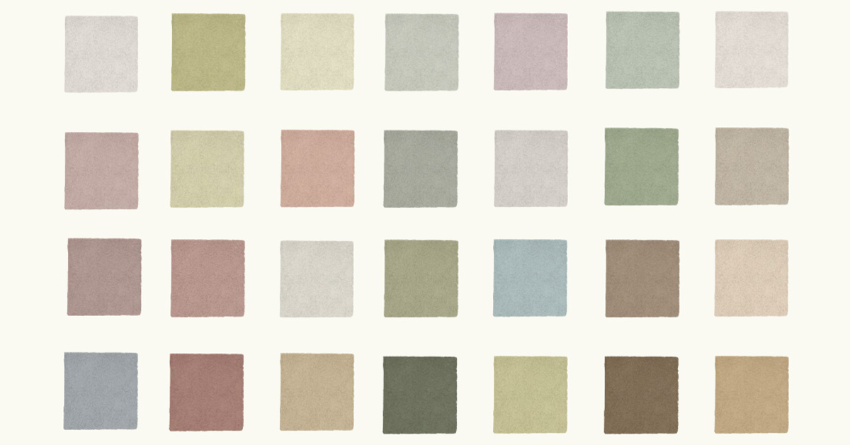
In the world of branding and design, colour plays a fundamental role in how a brand is perceived. Choosing the right colour palette can make the difference between a brand that is simply aesthetically pleasing and one that genuinely resonates with its audience.
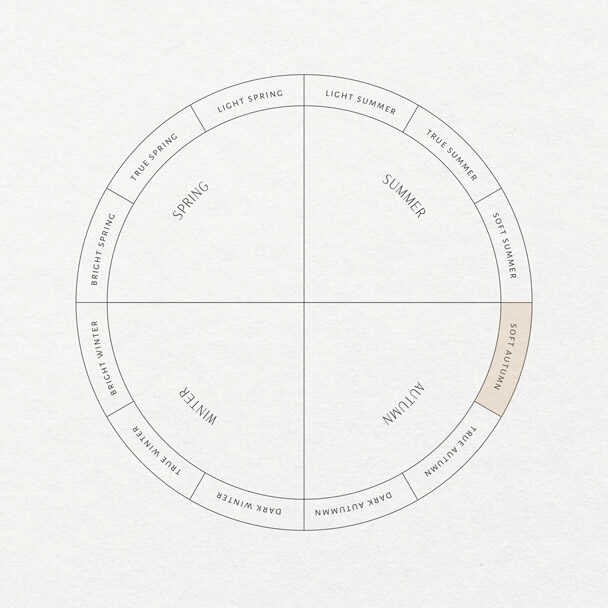
Seasonal colour theory is an approach that classifies colours into palettes associated with the four seasons of the year: Spring, Summer, Autumn and Winter — each with its own subcategories.
Every season is defined by a distinct colour palette inspired by the tones and nuances naturally found in the environment during that time of year.
Once the brand strategy has been defined, you can choose a colour palette that truly reflects its essence. In doing so, the message you want to communicate is translated to your audience with greater clarity, coherence and authenticity.
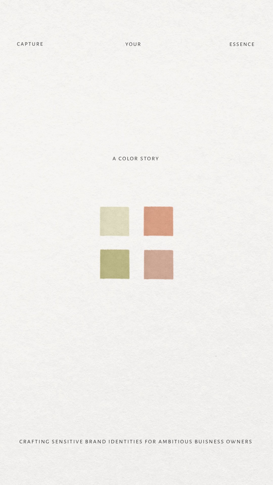
Soft Autumn palettes are defined by warm, muted tones that evoke the calm and comfort of an autumn afternoon. Think earthy hues, softened greens, ochres, gentle oranges and light browns.
These colours are not only visually pleasing, but also communicate a sense of calm, warmth and wellbeing.
Warm
Familiar
Sensitive
Natural
Grounded
Sophisticated
WELLNESS & LIFESTYLE
INTERIOR DESIGN
CRAFTSMANSHIP
PERSONAL BRANDING
COACHING
HOSPITALITY
In general, the colours that work best together are the ones that naturally coexist in nature. Think of foliage illuminated by the first light of a September morning.
Implementing a Soft Autumn palette into your branding strategy is not simply about choosing beautiful colours. It is a strategic process that should align with the identity, positioning and values of your brand.
Here are a few ways to apply it thoughtfully and effectively:
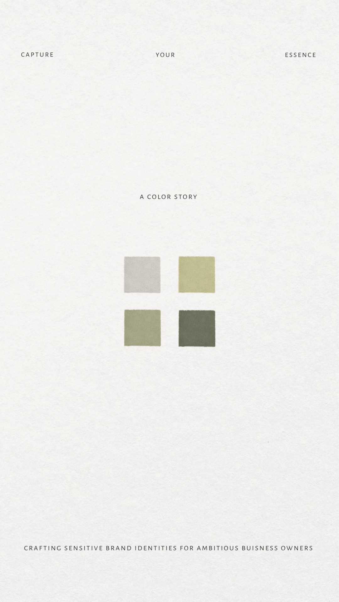
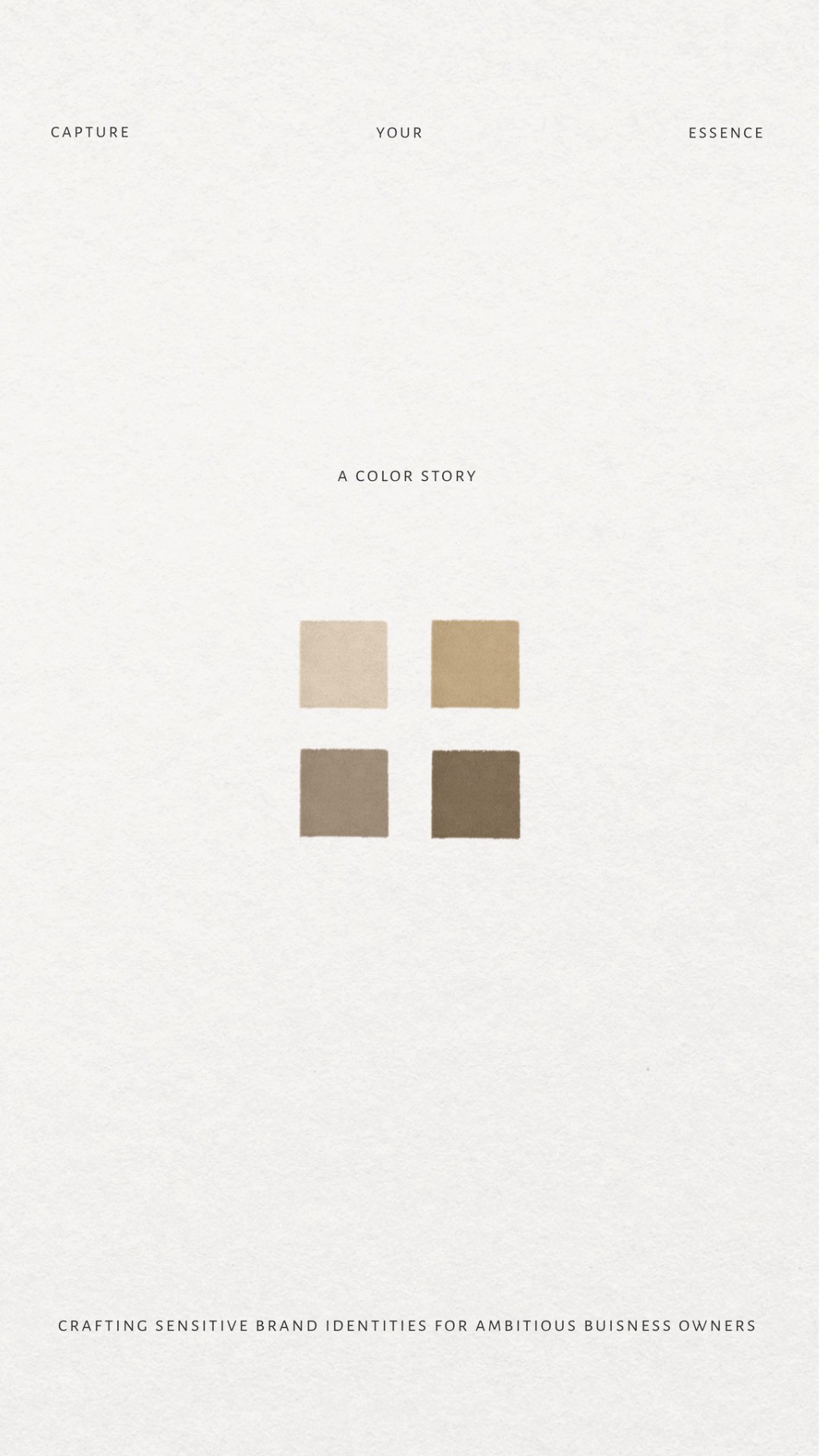
Choosing a Dominant Colour
Within the palette, it is important to choose a dominant tone that acts as the visual anchor of the brand.
This could be, for example, a soft terracotta, olive green or toasted brown. This will become the colour with the strongest presence throughout the visual identity.
Creating a Balanced Colour Palett
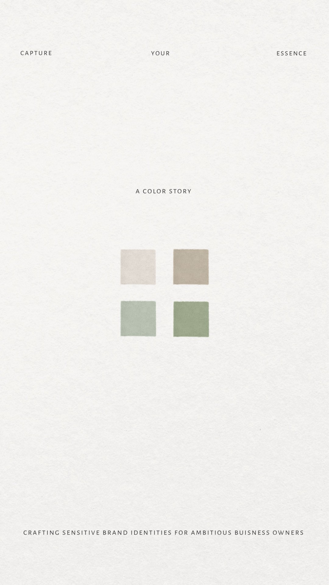
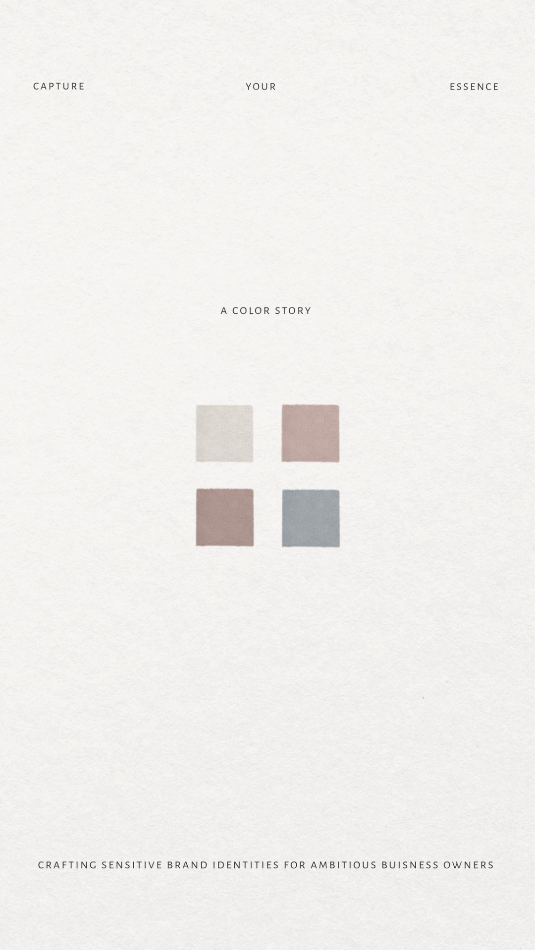
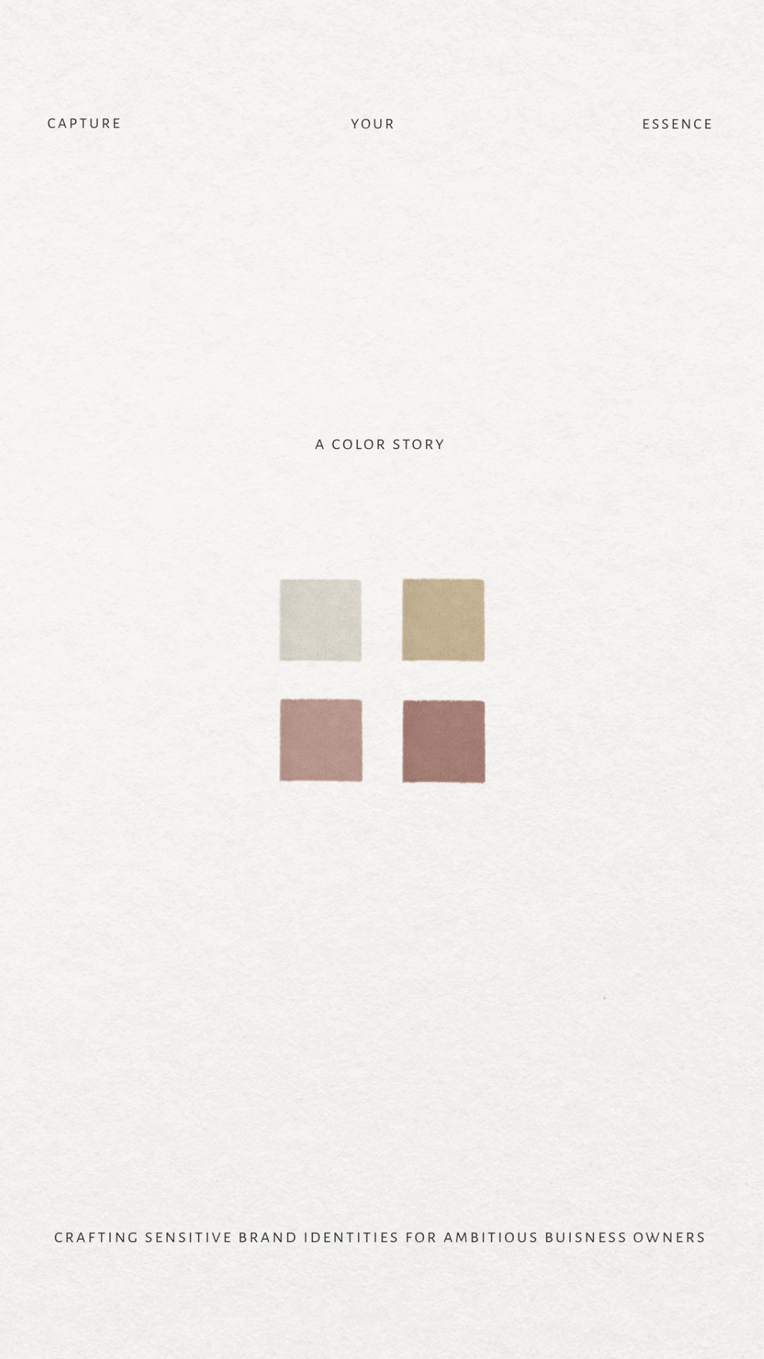
A visual identity based on the Soft Autumn palette typically works best with four to six core colours, including one dominant tone, two secondary colours and a selection of neutrals such as beige, cream or sand.
Neutral tones play a fundamental role, allowing the richer colours within the palette to breathe naturally throughout the visual system.
Integrating Typography and Texture
In branding, colour never operates in isolation. For a visual identity based on the Soft Autumn palette to feel coherent, the remaining visual elements must also align with the same atmosphere.
Elegant or editorial typography, clean compositions, natural textures, warm and slightly desaturated photography… all of these elements contribute to reinforcing the emotional language of the palette.